Your Essential Checklist
When the warmer months arrive, many of us naturally turn our attention outdoors. Whether you enjoy hosting family gatherings, catching up with friends, or simply want a quiet retreat after a long day, your garden can become an extension of your home. By making a few thoughtful upgrades, you can elevate the way you use your outdoor space and ensure it’s comfortable all year round. From stylish furnishings to innovative awnings with heating, here are some ideas to get you started.
Awnings with Heating
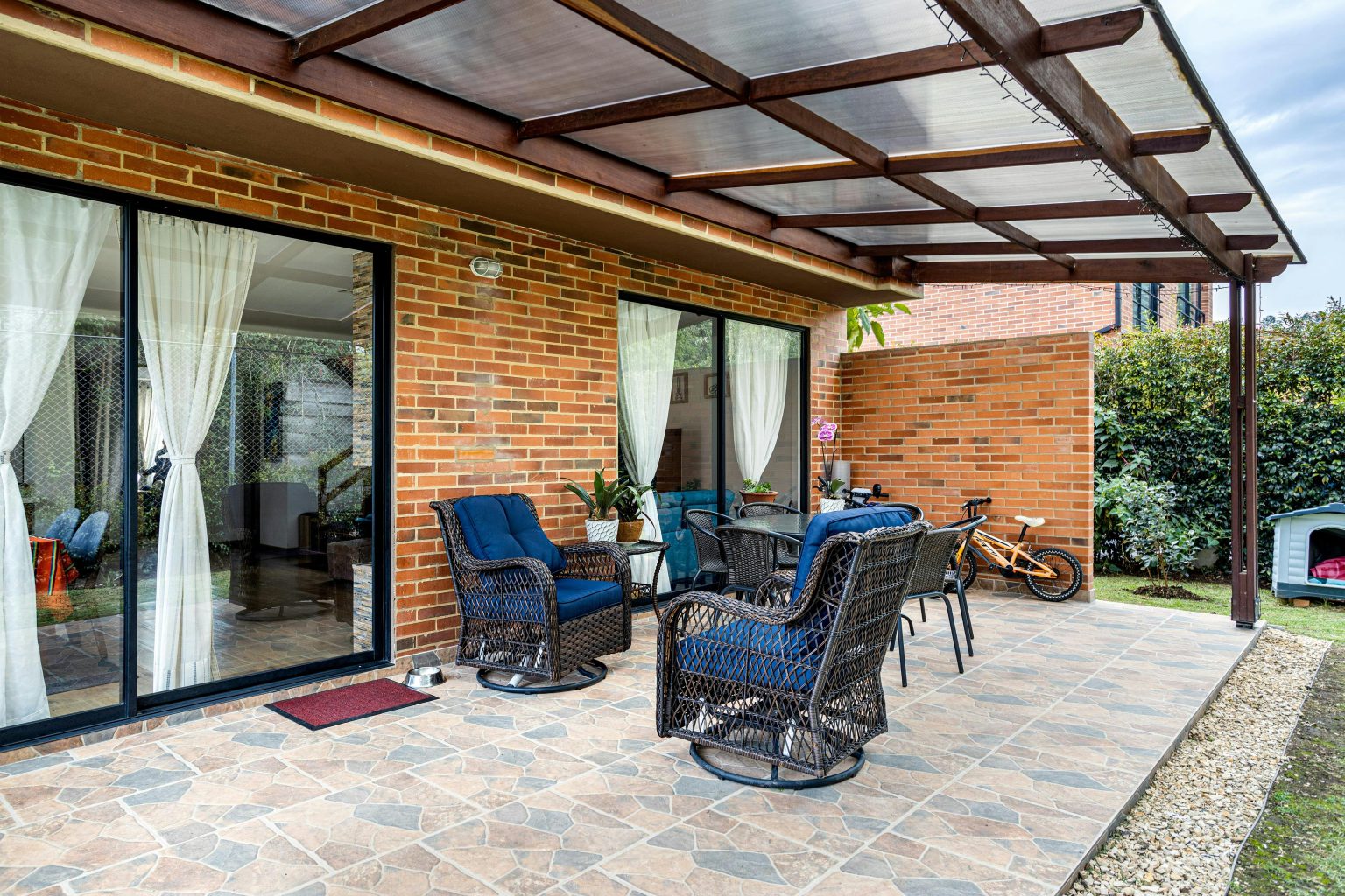
A patio awning has long been a go-to choice for homeowners wanting shade from the sun and shelter from unexpected showers. However, modern designs now go a step further. With integrated heating options, you can extend the use of your outdoor area well into the cooler evenings and even into the autumn months.
Not only do awnings with heating keep you warm, but they also create a welcoming and versatile space that feels like a natural extension of your home. Perfect for dining al fresco, enjoying a quiet evening drink, or entertaining guests without worrying about the drop in temperature, these awnings provide both practicality and a touch of luxury.
Create an Outdoor Kitchen
If cooking and entertaining are a big part of your lifestyle, an outdoor kitchen is a fantastic upgrade. For some, this may be as simple as upgrading to a high-quality barbecue, while others may want to go all out with a fitted kitchen including a sink, fridge, and even a pizza oven. By taking your culinary skills outside, you’ll be able to make the most of the longer days and enjoy meals surrounded by fresh air.
Update Your Furniture
Your garden furniture can make or break your outdoor space. Comfortable seating encourages people to linger, while a dining set ensures you can host with ease. Weather-resistant materials are essential, ensuring that your furniture stays in good condition for many years to come. Opt for styles that suit your taste, whether that’s sleek and modern or more traditional.
Consider Outdoor Heating
Even with warm summer days, evenings in the UK can quickly turn chilly. Adding outdoor heating to your garden ensures you can enjoy the space without cutting your evening short. Options include fire pits, freestanding heaters, or the more integrated solution of awnings with heating. The latter allows you to enjoy warmth at the touch of a button, seamlessly blending comfort with convenience.
Incorporate Greenery
Adding planters is a simple yet effective way to bring life and vibrancy to your outdoor space. They can be used to grow herbs for your outdoor kitchen, brighten up your patio with seasonal flowers, or even act as a natural privacy screen. Tall plants, trellises, or climbing greenery can help create a cosy, enclosed feel that makes your patio more inviting.
What Next?
With so many ways to enhance your garden, it’s worth planning upgrades that reflect your lifestyle. Whether you invest in stylish furniture, build an outdoor kitchen, or install awnings with heating, each addition will make your garden a more enjoyable and versatile space. Start small or take on a bigger transformation – either way, you’ll soon see the difference these changes make to your home.


